The Challenge
RF Connect is a leading national intelligent communications company that specializes in designing, optimizing and managing high performance converged networks and in-building systems. The Farmington Hills, Michigan-based company, with regional offices throughout the U.S., was founded in 2004. Team members discovered a key niche in providing in-building wireless enhancements for Wi-Fi, cellular and public safety uses, asset tracking, intelligent transportation and wireless backhaul. Currently, the company is utilizing its expertise and know-how and applying it to new platforms and ever-expanding areas, which will transform the company and its brand. RF Connect reached out to the Agency to develop and execute a plan to help reinvigorate its brand, reflect the expansive growth the company was exhibiting and better align with its overall vision for the future, as well as position the company as an industry leader.


The Solution
The Agency kicked off the project by hosting a Client exploration session referred to as “100+ mph thinking,” that involved RF Connect owners and key managers answering a series of questions about the company. With the intel extracted, the Agency went to work to develop an overarching brand statement and positioning line, along with a new logo that included a color palette that would visually reflect the company.
To effectively communicate and lead the RF Connect conversation, the Agency began by writing the company’s brand story before developing a positioning line. It simply stated that, if a business was looking for the most intelligent solutions for converged communications, then look no further than RF Connect. The positioning line that best captured this idea was: Intelligence begins here.
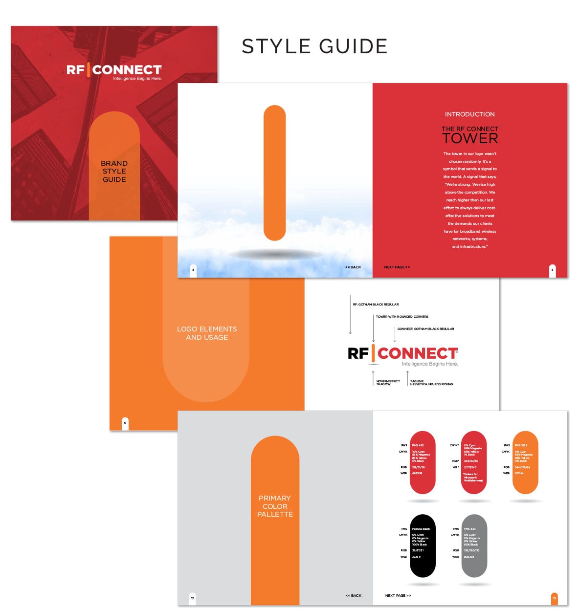
When it came to the logo, the Agency settled on red, white, black and orange to represent the bright, progressive and bold technology, strategy and future of RF Connect. Incorporating the new color palette, The Brand Architects™ encased the logo in orange and white and introduced the RF Connect tower, a symbol to signify the company’s strength, competitive edge and commitment to providing the most cost-effective solutions.
When the brand was visually defined with a positioning line and new logo, the Agency went to work to do a complete overhaul of the company’s website. The main focus was on the overall look and feel, as the company’s old site looked very dated. Incorporating elements of the new logo and color palette, the Agency infused red, orange and white accents throughout the site and also included the tower icon. Updated graphics and images contributed to the effort to make a complex and intimidating industry appear more fun and appealing.
Other key elements developed to help define the new brand included a corporate brochure, various digital flyers, a stationery suite, a brand style guide, a trade show banner and print ads.
Following a creative strategy, the Agency implemented an organic social media strategy utilizing Facebook, LinkedIn and Twitter platforms, along with a public relations strategy that concentrated on a national reach.


The Solution
The branding campaign successfully launched and has garnered great results. The social media strategy and public relations efforts have been effective, while the website has seen a significant spike in traffic and a steady increase in daily sessions. A few metrics we are seeing thus far include:
- Overall increase in followers, reach and engagement – all social media networks
- Facebook page likes increased by 8.15%
- Nationally published news releases
- Total engagement from news releases is above the stated industry average
- Over 5,500 web crawler hits
- Increase in overall website traffic
- New users increased by 6.8%
- Website sessions increased by 5.2%
- Average website session duration increased by 10%
The campaign is still in its infancy and continues to trend upward. Overall, the Client is extremely happy with the results and is very excited to see growth of the brand and its long-term success.


