





PART I
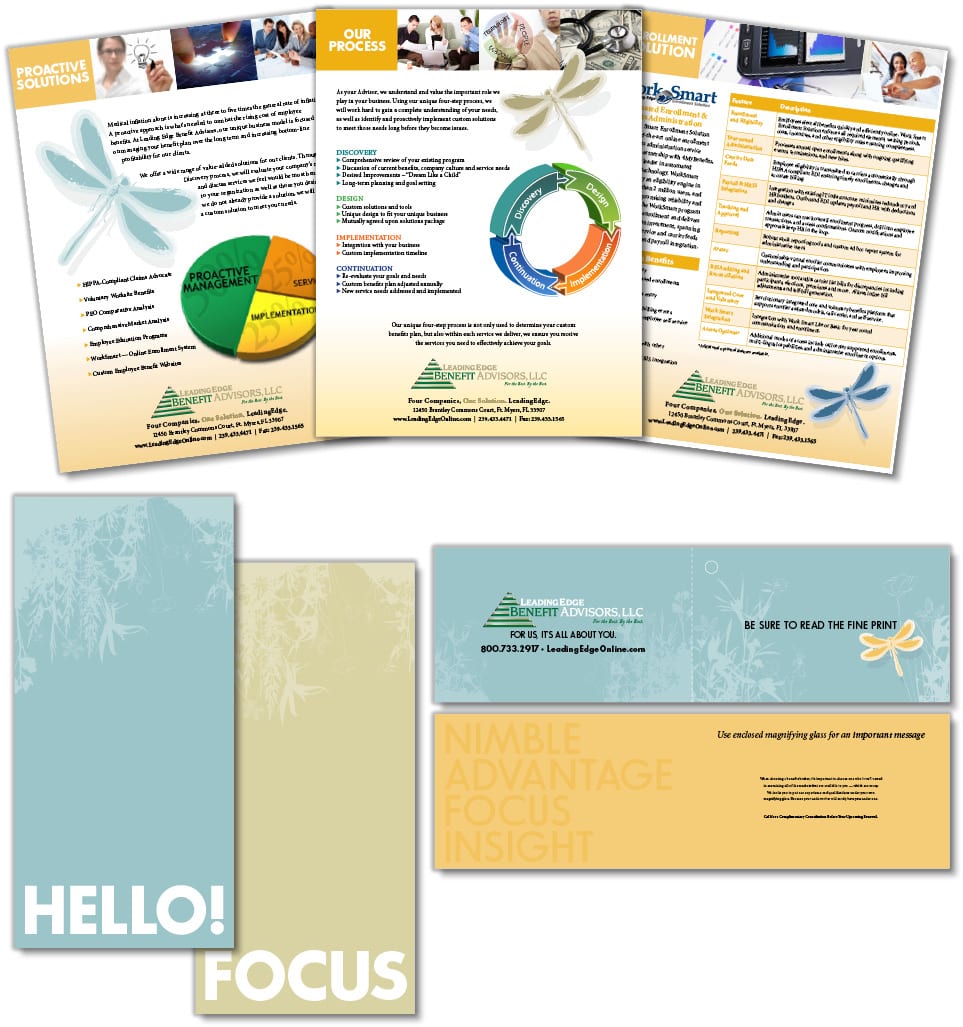
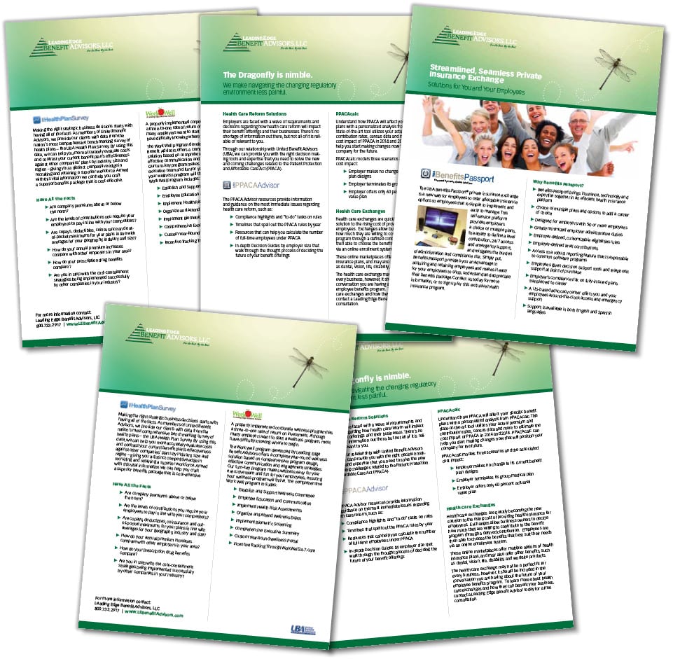
Leading Edge Companies provides expert advice and guidance to small and medium-sized businesses about human resources, wealth management, retirement and employee benefits. The client wanted to redefine their brand after many years in business, so they brought the Agency in. Company leaders were enamored with the idea that Leading Edge Companies was much like a dragonfly as portrayed in the book “The Dragonfly Effect.” The book is named for the only insect able to move in any direction when its four wings are working in concert. The dragonfly is also quick, nimble and agile. Central to The Dragonfly Effect is the notion that small acts that are coordinated well can result in big change. Also, the dragonfly can symbolize transformation and a rebirth, as Leading Edge Companies was in the throes of just such a change. The dragonfly is also the only insect that can fly in any direction, and silently hover as its four wings beat in unison. A challenge posed was ensuring the dragonfly could be effectively woven into every aspect of the business.
THE SOLUTION
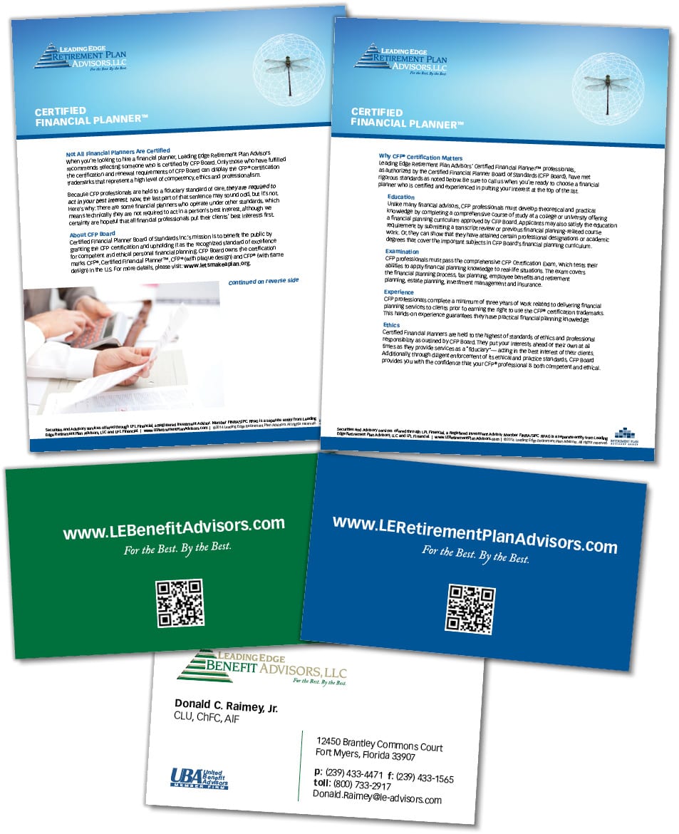
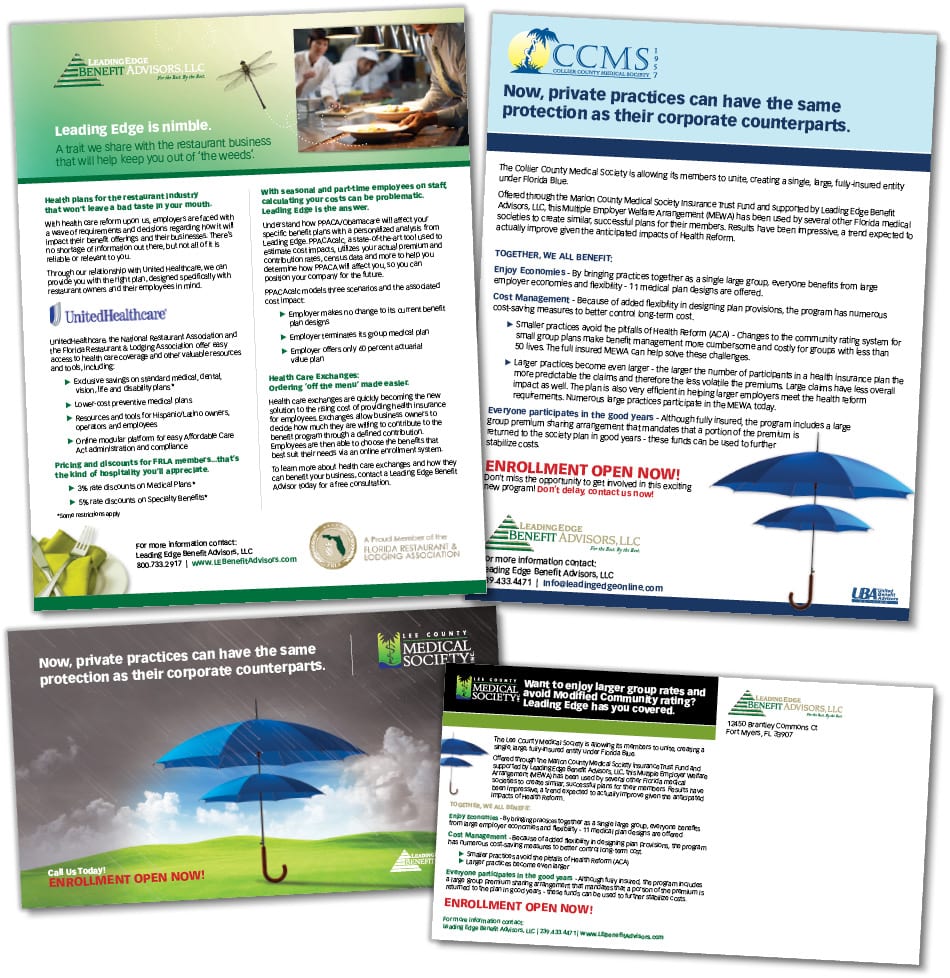
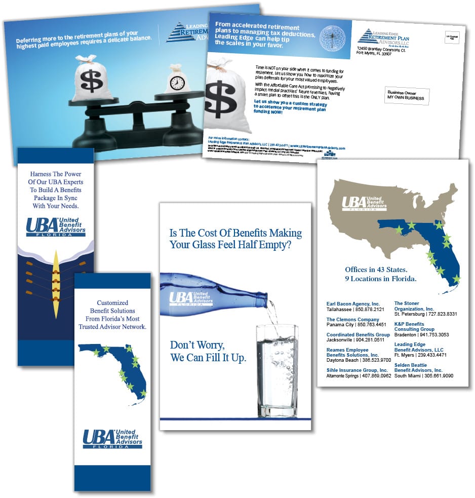
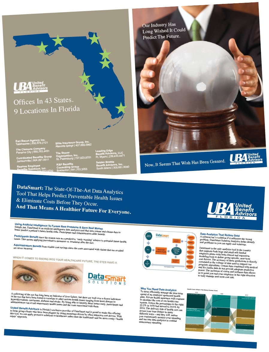
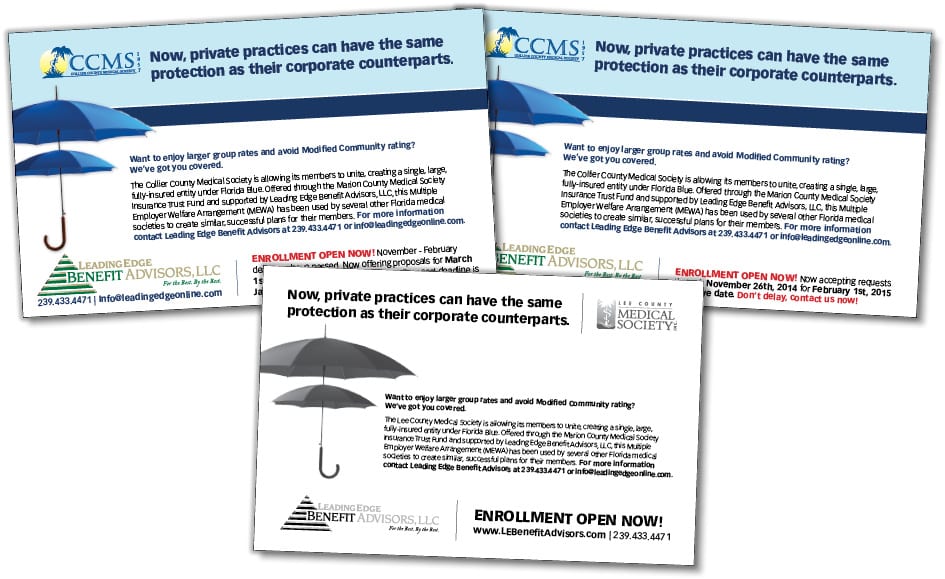
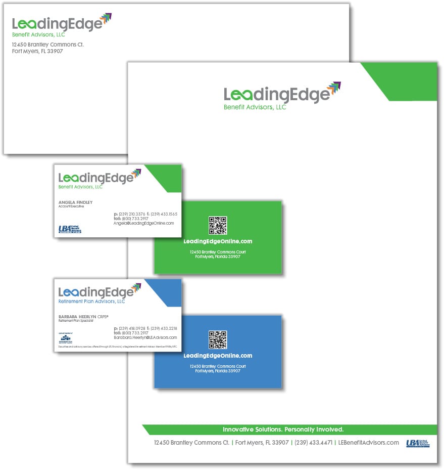
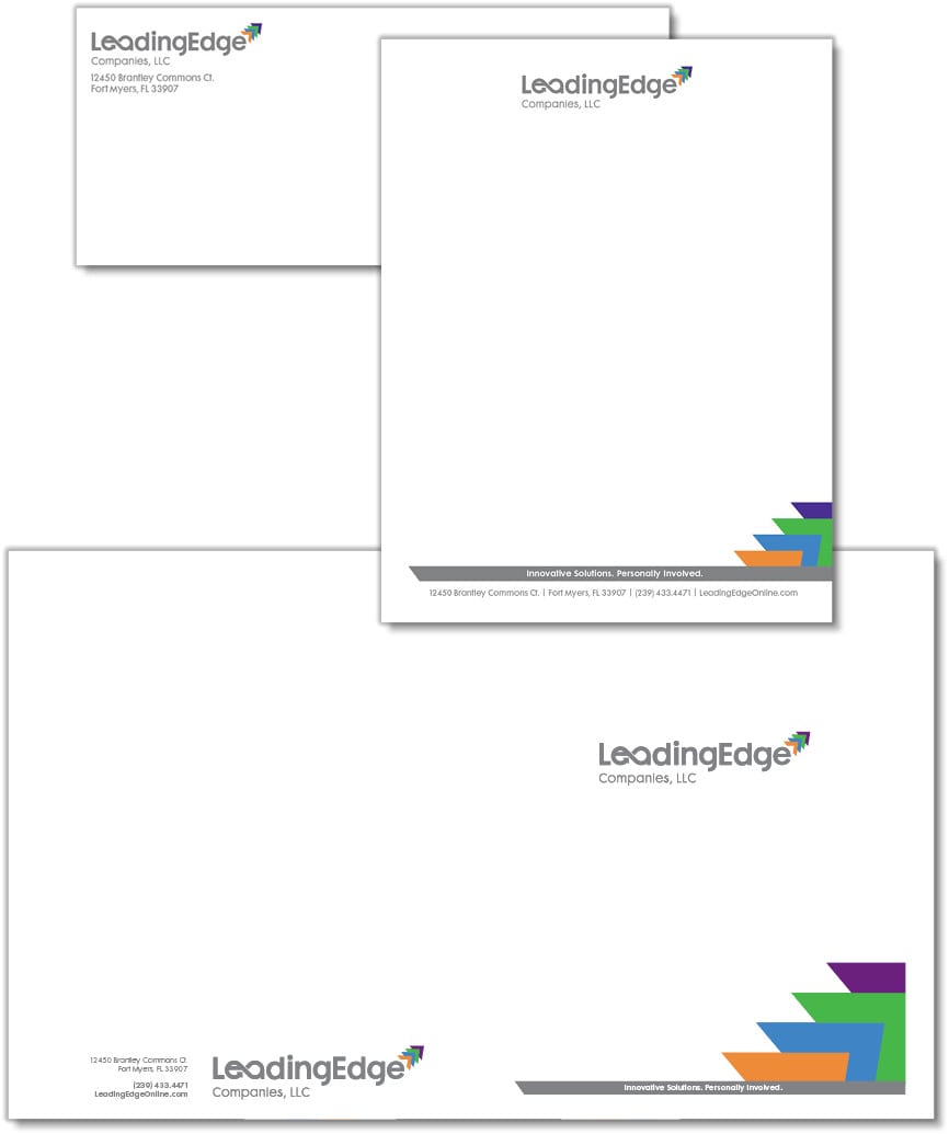
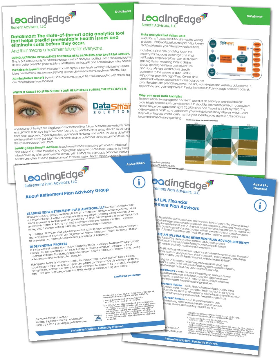
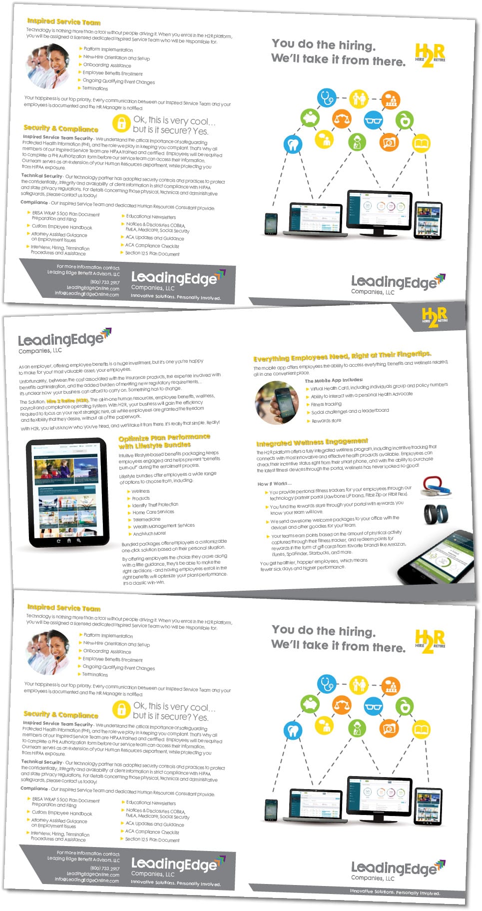
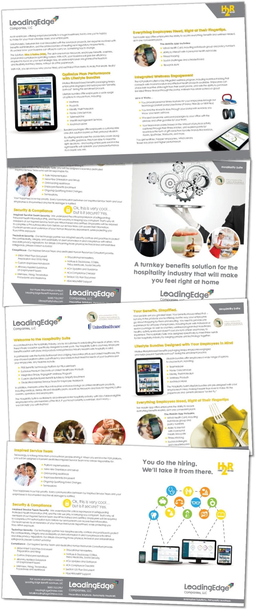
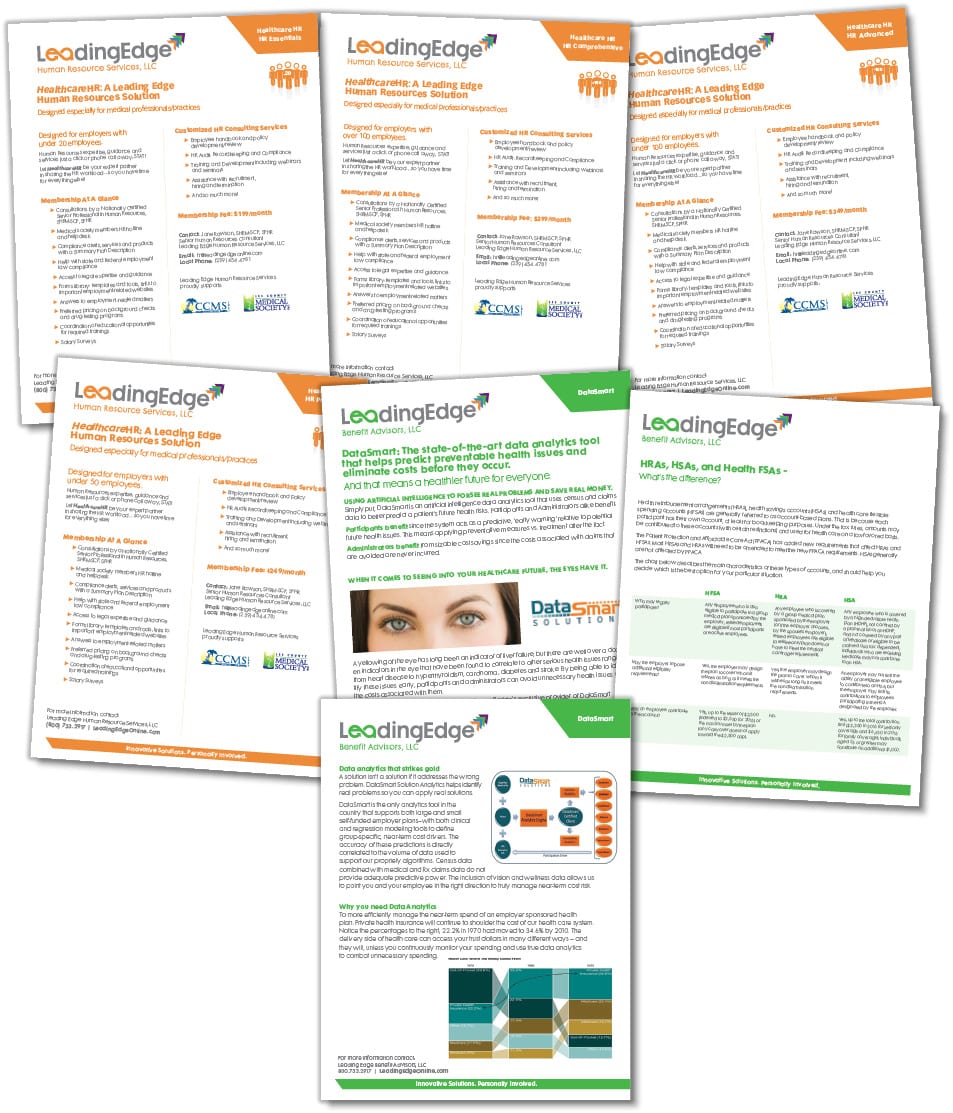
Using the dragonfly as the foundation, the Agency created an elegant look and feel using the insect as the main graphic but finessed enough so that the company would not come off as some type of bug-related business (not that there is anything wrong with that industry). Clever headlines played off the attributes of the dragonfly’s quickness, agility, nimble behavior, and ability to move in any direction, and tied it back to the similarities of working with Leading Edge. It was important to convey this messaging because the rebranding came at a time when the entire human resources world was being turned upside down with colossal changes, healthcare reform, and new compliance regulations that affected all four divisions of Leading Edge Companies. The creative was applied across the board to all of the client’s print collateral, website, online marketing tools and online ads.
THE RESULT
The agency successfully positioned Leading Edge Companies as the one-stop source to navigate the changing landscape that so many businesses were encountering. While Leading Edge already was profitable and flourishing, it needed a new brand to become even more recognized as the go-to experts to help keep organizations headed in the right direction quickly, efficiently and with agility.
PART II
Once again the firm turned to The Brand Architects at Spiro & Associates as it had done three years earlier, this time to evaluate their entire brand, including the logo, and decide whether it was time to evolve it or change it completely. The invitation came as Leading Edge Companies noticed a marked change in the inner workings of their industry and wanted to further evolve and keep pace with it.
As noted in Part I, Leading Edge Companies adopted the dragonfly as its corporate symbol, using it to draw certain parallels between the dragonfly and its four divisions. The device worked nicely in brand communications, but caused some concern when communications focused on product-related topics. The Agency identified three main issues moving forward:
- How do we evolve/rebrand the Leading Edge brand?
- How do we accomplish this while preserving the equity Leading Edge has in the dragonfly symbol?
- Any new logo design must be more “production-friendly,” particularly when it comes to reproducing it on apparel, etc.
THE SOLUTION
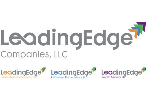
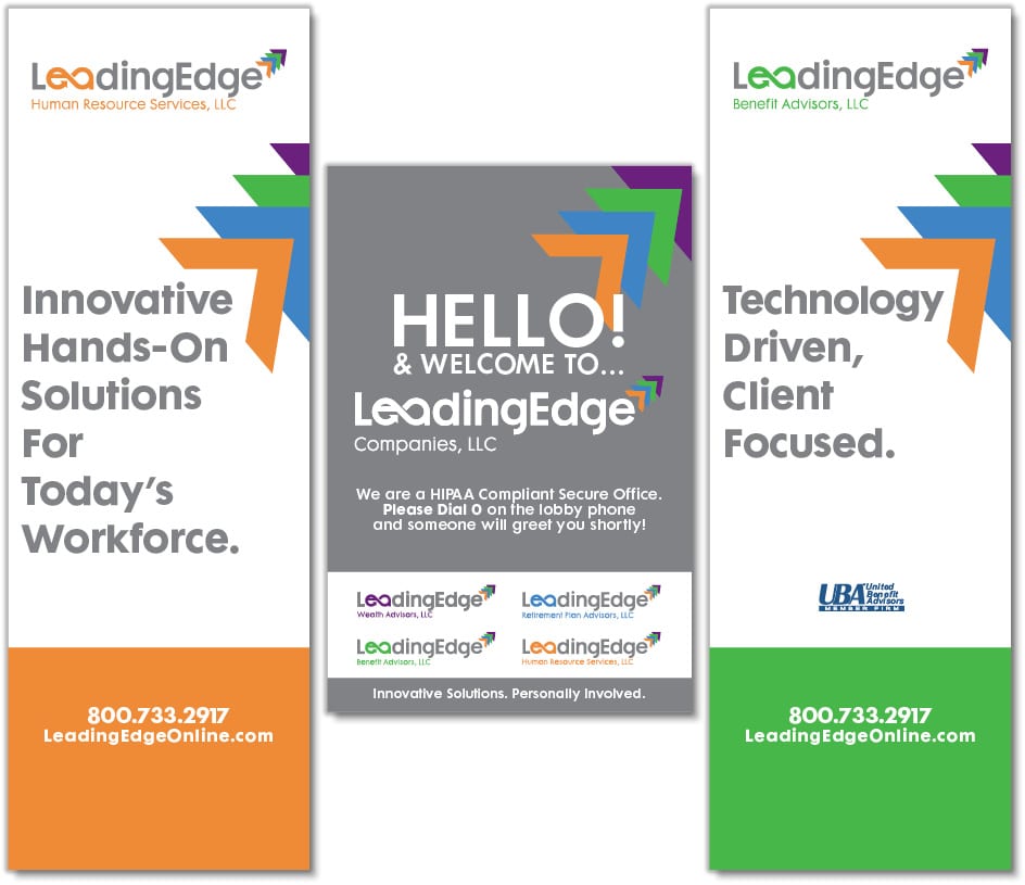
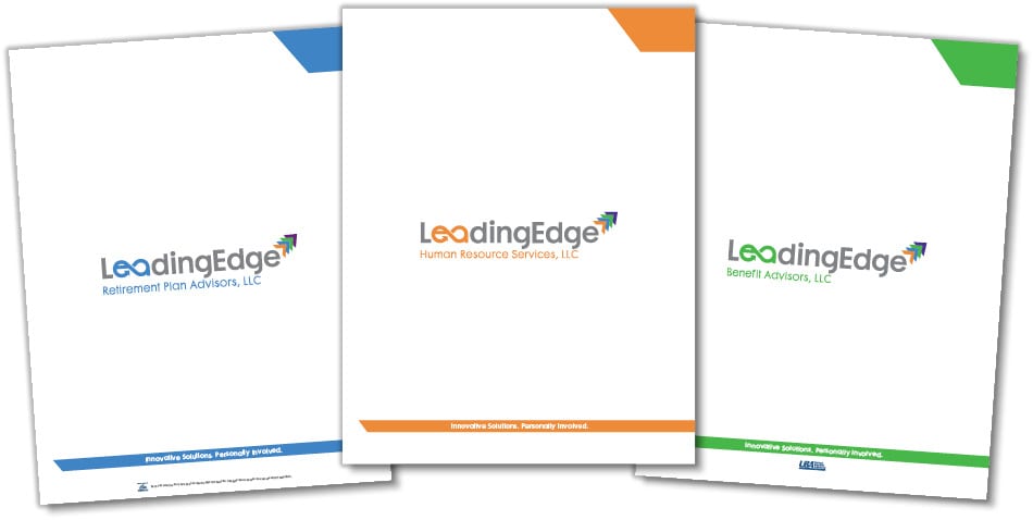
After examining the client’s goals, the Agency recommended more than just a logo overhaul. If Leading Edge Companies was to change with the times, a more well-rounded effort was in order. The new Leading Edge Companies logo incorporates the infinity symbol, giving rise to the notion that the firm offers limitless value and ambition, infinite possibilities across the clients’ business spectrum. It also features a multicolored icon of arrows pointing upward, signifying the company’s never-ending quest to move their clients forward with the best services and benefits. Of course, four arrows also represent the four Leading Edge divisions not only by number but color as well. In addition to creating a clean and bold new logo, the Agency also refreshed their collateral, website (working with Stickboy Creative) and stationery with the new theme.
We also introduced “Stick Man,” a stick-figure spokesperson that comes across as a mad scientist in a laboratory who helps clients sort out the super-complicated world of corporate benefits. Stick Man came about because it seemed like a mad scientist was running the business universe, what with the new managed care and other complex regulatory requirements. An animated figure was mostly unheard of in Leading Edge’s conservative industry so Stick Man was created to break through what the competitors were doing. Stick Man loosened up Leading Edge’s image while still delivering serious advice and messaging.
In April 2015, the branding evolution was rolled out to a large crowd at Leading Edge’s first “Mad Science” Affordable Care Act (ACA) event held at Hyatt Regency Coconut Point in Bonita Springs. The “Mad Science Behind the Future of Employee Benefits” program involved discussion and guest participation about the future value of employee benefits under ACA and the impact on employers and their business. A “Top Secret” announcement also was made – a Stick Man video projected onto an oversized screen to explain how Leading Edge had taken a step back to evaluate all the changes in the industry, their brand and their place in the market, and how that would help clients and prospective clients. Thus the new brand was launched.
THE RESULT
As of this writing in 2016, Leading Edge Companies continues to attract new clients, maintains an extensive client roster, and enjoys a reputation of excellence in their field.


