

LOGO DESIGN

POSITIONING LINE GRAPHIC
RESULTS AT A GLANCE
TOTAL RESERVATIONS
DEPOSITS/RESERVATIONS GENERATED BY THE AD AND POSTCARD SERIES
%
E-BLAST CLICK-THROUGH RATES
%
E-BLAST OPEN RATES
The Challenge
As a long-time quality developer, best known for their part in the revitalization of the River District in Historic Downtown Fort Myers, The MacFarlane Group was about to add a new high-rise project to their portfolio. They were converting the abandoned landmark hotel, The Amtel, into an age-restricted active adult community with luxury amenities at one of the only remaining riverfront locations that heightened its appeal. Campo Felice Retirement Living will have 323 well-appointed independent living residences with blue reflective, storm- and sound-proof windows that look out onto one of the most picturesque points along the Caloosahatchee River, as well as four eateries (including two gourmet restaurants) and five-star resort amenities. A transformation of this magnitude meant an incredibly exciting opportunity for Spiro & Associates to develop a brand identity to make Campo Felice’s upscale personality evident, as well as attract deposits and reservations as quickly as possible.

IN-HOUSE AMENITIES LOGO DESIGNS
The Solution
The foundation for our campaign was a positioning line that clearly differentiated Campo Felice from the potentially stigmatizing “retirement home” label – “Senior Living Reimagined!” First, Spiro & Associates Marketing, Advertising, Public Relations and Brand Architecture designed an eye-catching logo with the destination name rendered in a stately, deep-blue serif font with an icon in the middle. The graphic treatment alludes to the building’s river-facing façade and height. The sailboat symbol reveals the project’s enviable location, while “Retirement Living” is displayed in a burnished-gold, sans-serif font to suggest Campo Felice’s contemporary design.
To give the campaign the same energy and enthusiasm as its targeted audience’s generation,
we established a hot, vibrant color palette and upbeat tone and manner for the copy. At the center of this campaign was an elegant brochure that highlighted Campo Felice’s amenities through fun lifestyle imagery and model suite illustrations. Inserts included floor plan options, pricing and building renderings, as well as Agency-designed dining menus with custom color schemes and logos. The brochure was placed in a pocket folder with a water image to introduce residents to their new home and a large typeface that makes it easy for our target prospect to read.

BROCHURE DESIGN

BROCHURE DESIGN
While imagery from the brochure prompted the first wave of interior sales office signage, the client also needed signage that would surround the property. The continuous silt fence signage was created with a deep blue background. The images showcase daily life and fun living that passersby can easily see from all busy intersections. In addition, select site signage drew prospects to the website to request more information.

EXTERIOR SIGNAGE
To further capitalize on key amenities and announce the new destination, The Brand ArchitectsTM created a direct mail postcard series with downtown views and interior photos that were sent monthly to potential local prospects to individually highlight an amenity or service. Magazine and newspaper ads accompanied this series and were intended to drive traffic to the leasing office and website, which the Agency built as a 100-plus page hub for calculating savings and navigating one’s way through virtual tours of the all-inclusive community. These ads announced eight floor plans and features unique to 55-plus living. They also positioned the builder as a reputable contributor to the community.
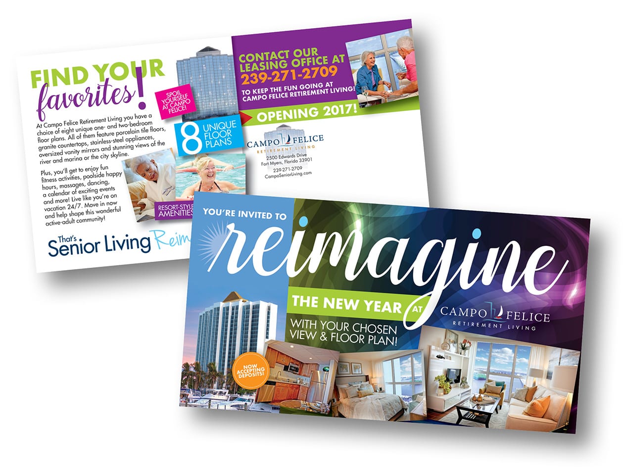
DIRECT MAIL

DIRECT MAIL
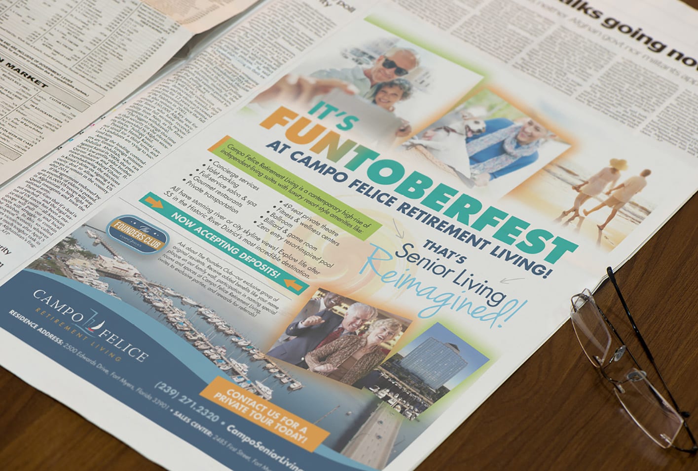
MAGAZINE AND NEWSPAPER ADS

MAGAZINE AND NEWSPAPER ADS

MAGAZINE AND NEWSPAPER ADS

EVOLVING WEBSITE

E-BLASTS

E-BLASTS

E-BLASTS

E-BLASTS
To bring Campo Felice to the broadcast market, the Agency developed the concept, scripting and art direction for a memorable television commercial. A high-energy dance soundtrack inspired our original, custom jingle and took viewers through a day in the life of a Campo Felice resident – swimming, boat rides, relaxing at the spa, dining downtown and watching the sunset over the cityscape.

JINGLE AND TV COMMERCIAL

JINGLE AND TV COMMERCIAL
As a way of closing out the year, The Brand Architects created a holiday mailer on soft pearlescent cover stock paper with a spot glitter to mimic the winter wonderland theme of the first of many Campo Felice holiday parties.

HOLIDAY CARD
The Result
The holiday party proved to be the client’s most successful event to date, with over 300 attendees and huge media coverage. The commercial with the jingle generated many calls, especially when it ran in the Boston market during the winter months. The commercial also airs regularly on local stations.
The direct mailer also proved to be one of the most successful elements of our campaign, with the first postcard generating over 20 calls on the first day that it hit mailboxes.
Right now, Campo Felice has over 110 total reservations, with 151 deposits/reservations generated by the ad and postcard series. Even email marketing proved to be very successful, with click-through rates of over 11% and open rates of over 15%.
With this buzz have come several articles in business, online and top-tier media outlets across Southwest Florida. We attribute this to a series of press releases and pitches detailing each step of the Campo Felice project.
Lastly, as the grand opening draws near, the website is continuing to evolve and serve as the major news source for all things “senior living reimagined.”


